StocksToTrade offers four types of chart styles:
- Candlestick Chart - Default
- Heiken-Ashi Candles
- Bar Chart
- Line Chart
You can switch styles at any time by using the style selector button: 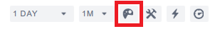
Candlestick Chart
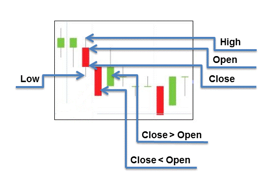
A candlestick chart consists of candle bars that represent the security values for a specific duration of time (Click here for Changing Chart Intervals). Each candle shows the opening, closing, high, and low values for that specific period.
High and low price values for any given period are represented by the top and bottom candlesticks, respectively (thin vertical line). The height of the candle's body is determined by the difference in price between the opening and closing prices (close price minus open price), while the coloring reflects the sign of this difference: red indicates a negative difference (close less than open), and green indicates a positive difference (close greater than open).
Each of the limit values of the candle (high, low, open, close) is represented graphically on the y-axis.
Bar Chart
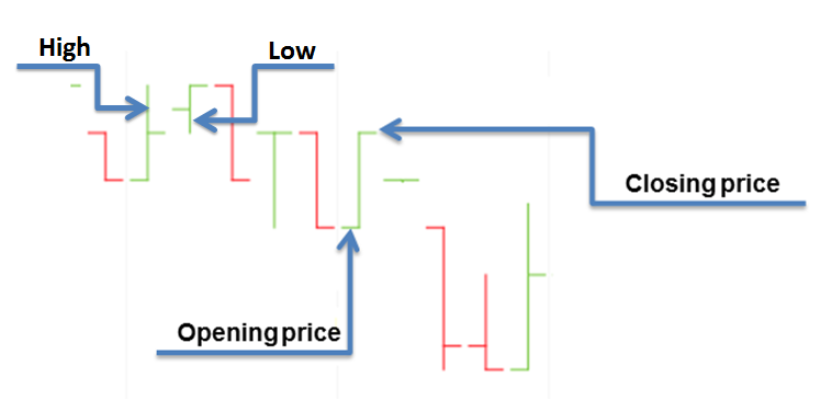
The bar chart provides a similar approach to candlestick charts by displaying opening, closing, high, and low values for a given period, with the sign of change represented by color. In the bar chart, the top of the vertical line indicates the highest price of a stock during the day, while the bottom represents the lowest price. The closing price is displayed on the right side of the bar, and the opening price is shown on the left side of the bar.
Line Chart
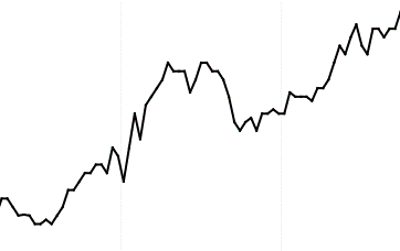
This is the most basic chart that represents a plot with the last traded price in relation to time for the defined time frame.
| << 3.2 - Chart time range and interval | 3.4 - Chart tools >> |
 Cam M.